
Choosing a wall colour is often treated as the final decorative decision. In fact, it can be the starting point for a more coherent interior. A colour concept connects the light in a room, the existing finishes, furniture, flooring and the atmosphere people want to create. It does not require every space to match, but it gives the home a visual logic.
The best approach begins before a paint chart is opened. Notice the direction of natural light, the proportion of the room and the fixed elements that will stay in place. A timber floor, kitchen front, stone fireplace or patterned tile can all become a useful reference point. Homeowners who want help connecting these details may benefit from a professional colour concept rather than selecting shades in isolation.
Read the room before choosing the palette
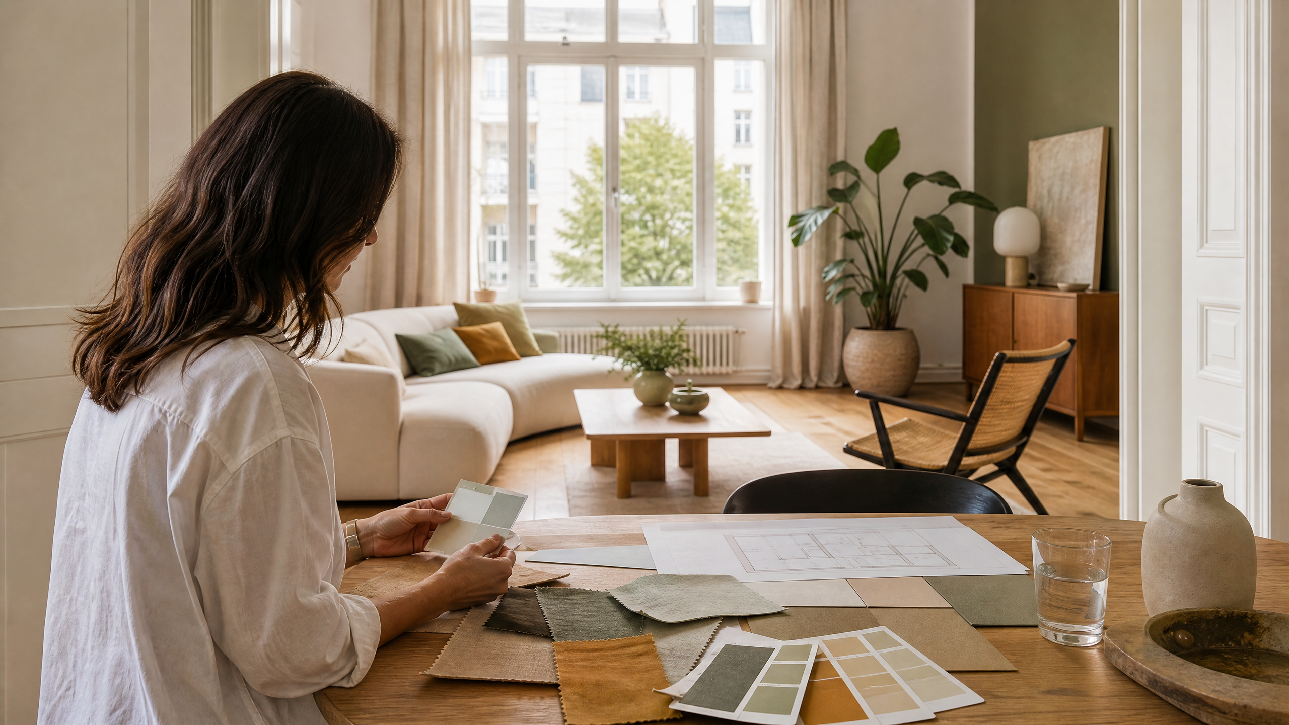
Light changes the way colour is perceived. A shade that appears soft in a north-facing room can look completely different in a warm afternoon light. Artificial lighting has a similar effect. For that reason, small samples should be viewed in the actual room at several times of day. Paint a larger test area or use movable sample boards instead of deciding from a tiny paper chip.
Consider how the room is used as well. Bedrooms may call for a calmer, lower-contrast palette, while a hallway can carry a deeper accent that would feel heavy in a room used for long periods. Workspaces often benefit from a balanced background that supports focus without appearing sterile. The aim is not to follow a single trend but to make each space feel appropriate to its purpose.
Build a palette with roles, not random favourites
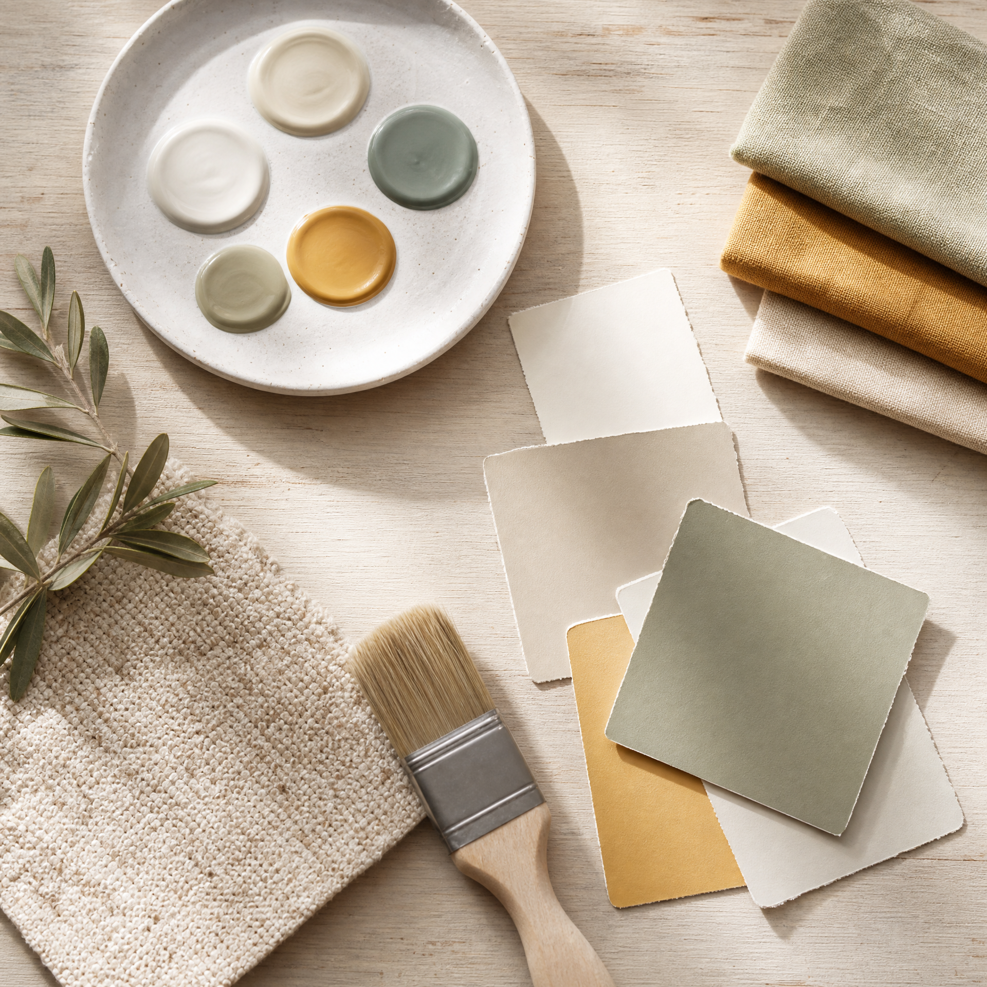
A practical scheme usually has a dominant base, one or two supporting tones and a smaller accent. The dominant colour may cover most walls, while supporting tones appear on an alcove, woodwork, textiles or adjoining rooms. The accent can be subtle: a muted colour inside a recess, an artwork wall or a single piece of joinery.
This approach keeps choices manageable. It also allows a home to evolve. If the base palette is flexible, accessories and smaller furniture can change without requiring another full redecoration. For more complex spaces, interior colour planning in Berlin can bring the floor finish, light conditions and connected rooms into one considered plan.
Use finish and texture deliberately
Colour is only part of the visual result. The sheen of a surface affects how light moves across it, while texture can make a colour feel softer, deeper or more tactile. A very matt finish can create a quiet backdrop but may require thoughtful placement in high-contact zones. More durable finishes can suit corridors, kitchens or family areas where walls receive regular use.
Texture also offers a way to introduce contrast without adding many new colours. Natural textiles, timber, plaster-like surfaces and patterned wallpaper can work together when their undertones are compatible. When testing samples, place them next to the materials that will actually be in the room rather than viewing them against a blank white wall alone.
Keep transitions between rooms in view
Doors are often open, and the view from one room to another affects how a palette is experienced. There is no need for a continuous colour across every wall, but adjacent spaces should have a relationship. Repeating a warm neutral, a dark trim tone or a material finish can create continuity while allowing each room its own character.
A successful scheme is one that feels comfortable in everyday life, not simply dramatic in a single photograph. By observing light, assigning each shade a role and testing materials together, homeowners can develop a coordinated colour scheme with a professional starting point and a clear plan for the rooms that follow.